

This article is designed to help you understand the various ways to create not just a landing page but a truly effective lead capture system that grows your online business by building a subscriber list that puts you in a position of consistent monetization.
TABLE OF CONTENTS
1) What Exactly is a Landing Page?
2) Why Do I Need a Landing Page?
3) How Do Landers Work?
4) How Do I Create a Landing Page?
5) Choosing the Platform
6) Installing Plugins
7) Autoresponder
8) Two-step Opt-in Buttons
9) Five Expert Lander Conversion Tips
10) Anatomy of a Lander
11) Alternative Lander Style
12) Ensuring Your Lander CRUSHES It
13) The Power Of The Word FREE
14) Bridging the Gap LIKE A BOSS
15) The Step Box Phenomenon
16) Benefits of Adding a Step Box
17) Critical Post Subscription Process
18) Set Up Your Killer Landing Page!
In the world of digital marketing, promoting and selling products might seem effortless to you at first. You may think all it requires is getting people to click on your offer link. And yeah, that sounds easy enough until you realize that nothing you do is actually converting visitors into buyers. That sucks.
The fact that you don’t know where you went wrong makes it all the more frustrating. So, like a good marketer, you try creating a landing page to capture leads and warm them up BEFORE promoting products to them but that’s just not working either.
Your list just isn’t growing fast enough, and you’re not making any money. ARRRRRRG! What could it be?
Is your headline a bummer?
Do you need to modify the color of the buttons?
Is it the font or the images?
Could it just be a crappy lead magnet?
There are so many possibilities to consider.
BUT… listen, there is hope! This article will demystify some of your preconceived notions about affiliate marketing and get you focused on the pieces that will make the biggest difference for you.
Take a deep breath, and let’s start at the beginning. Let’s talk about your landing page.
A landing page is one of the most significant pages to create for your online business because it’s the first place your visitor lands before they see your sales page, before they join your mailing list, and even before they learn anything about you. The landing page serves as the portal to your company and pretty much your entire online universe.
The importance of landing pages cannot be overstated.
So… what exactly is a landing page?
Your landing page or “lander” is the first page of your website or sales funnel that your prospect sees.
There are many distinct pages found in a proper funnel. A sales page, a download page, and a bridge page can all be included. Your funnel pages could all be part of a membership site or an eCommerce site. There are a variety of pages for each sort of site that you can have in a sales funnel, and they are all important, BUT… no-one will ever see them if they don’t get past your lander.
The landing page is usually the first step in the sales process. Whether they go to a sales page, subscribe to your list, shop at your eCommerce store, or read your blog, they’ll typically start at your lander. It is completely up to you where the visitor gets redirected to after they subscribe on your lander.
That’s where the fun begins!
Maybe you’ll direct them to an affiliate product, a bonus page, or any number of pages. The point is that they arrive at your landing page first, which is where you capture the lead. This is, in general, how you get them into your autoresponder and grow your subscriber list. This is a critical part of your online business, and if you skip it or screw it up, you’ll struggle to stay afloat down the line.
Why do I need a landing page?
First and foremost, a landing page provides you with subscribers, and it’s how you build your list, but this is also how you start raising impulse for whatever you want them to do NEXT. This is when you start introducing them to the following steps they’ll be exposed to in the funnel.
Through landing pages, you entice visitors to give you their contact information, such as their email address and name. You usually do this with an ethical bribe, in which you offer them something you know is of interest to them in exchange for signing up to your mailing list.
It is important that you begin to raise impulse or prepare them for whatever you want them to accomplish in the next pages of the funnel. This is done by telling them what to expect on the next page. Do this by hinting or teasing them about it in order to raise curiosity. This is what makes them WANT to sign up in order to discover what’s on the other side.
But… How do landers work?
Quite simply the lander is a page that offers an exchange of value for their contact details. The way this typically works is that you display an image of a product they want and tell them they get it free if they subscribe. The key is to keep it simple.
PRO TIP: The free product you offer on your lander has to be something THEY WANT. This is critical. Don’t think everybody wants what you got just cause YOU like it or just cause it's free and looks pretty. Nothing could be further from the truth.
You must have the right product for the traffic and/or the right traffic for the product, or this whole process falls on its face. Newbies that dismiss this will fail miserably and probably blame Trump.
The less stuff you put on the landing page, and the simpler the design is, the better it will work for you. It is detrimental to flood it with too much information. The landing page will not convert as effectively as it should if it’s cluttered. Less is more.
The goal of the landing page is for them to be led (redirected) somewhere else once they input their name and email address into your form. This is known as an “opt-in.” When you build your landing page, you can enter a “redirect URL” on the submit button for your opt-in form. The process for doing this may vary slightly depending on whatever site builder you’re using.
By inserting a redirect URL into your submit button, your website instructs the browser to redirect them to somewhere else after it is clicked. That “somewhere else” can be anything you want. It could be the sales page, as we discussed earlier. It may be the download page. It could be a variety of things, depending on how your funnel is set up.
Then… how do I create a landing page?
Nowadays, there are lots of drag-and-drop page builders out there that you can use. Many of them even come with built-in landing page templates. There are just some miscommunications about the vernacular of landers (landing pages) because different platforms call it different things.
You may be asking, “Well, isn’t that just a squeeze page?”
The answer is yes, a “lander” or landing page is the same thing as a squeeze page. If you ask ten different marketers, you’ll get ten different definitions. But essentially, a squeeze page is a landing page, and we call it a lander. Cause saying “lander” makes you look cool. Like Fonzy.

STEPS FOR CREATING A KILLER LANDING PAGE
1. Choosing the Platform
A lander is nothing more than a web page, and there are many different platforms to choose from nowadays for building web pages. There are many drag-and-drop site builders where you can just go in and start creating landers right away from a template.
You can get yourself a membership at Groove Pages, ClickFunnels, or any number of other purpose-built drag-and-drop platforms. Then just choose a pre-made, pre-designed, stunning landing page template and then fill in your information. Shazam! You’ve got a lander.
We do things a little differently here for several reasons. WordPress is our preferred platform.
We use WordPress because it is free, versatile, and very popular. Did you know that WordPress accounts for 40% of the entire Web and 62% of CMS-built websites! It’s simple to use, and there are numerous plugins and themes available. We like to use a WordPress plugin called OptimizePress as our web page builder, which comes with an array of beautiful pre-built page templates.
Everyone’s aptitude for web design is different. We each have different budgets as well. When selecting a platform to build on you should consider not only price but also appearance, features, reliability, and ease of use. Make sure it’s something that has all the features you want and need but also something you’ll be comfortable using at your skill level. Also, make sure it’s something you can afford to pay for even as your business is growing and not making any money yet.
2. Installing Plugins
Plugins are basically little apps that you can install on your WordPress site to add a set of features that you need. Perhaps you’d like to include a countdown timer on your landing page. Maybe you wanted to add a video or a small pop-up box or something. Since those things don’t come with WordPress by default, you can usually find a free plugin to make it do whatever you want.
There are hundreds of thousands of plugins available for WordPress. If the WordPress theme you’re using doesn’t have a particular feature by default, you can easily install a plugin to make the page perform exactly the way you want. You can search through thousands and thousands of free plugins in the free WordPress plugin repository. There are also many paid plugins available online. We use OptimizePress, which is a very powerful paid plugin.
If you are not using WordPress, then you need to make sure your site-building platform has the exact features you need built in. If the platform you chose to use doesn’t offer a feature you want for your page, you’re out of luck, and you may need to switch to a different platform. Generally speaking, most of the reputable site builders like Groove will have everything you need already built-in, and there is no need to worry. However, if you’re using WordPress, you can typically get any feature you want to be added instantly by installing a plugin.
3. Autoresponder
An autoresponder is a software service where you store your subscriber list data and bulk email them. Once you’ve got a platform to build your lander on the next step is to link your autoresponder so you’ll be able to capture leads. You’ll be growing your list using your autoresponder. There are a lot of them around to choose from.
Many people start with either AWeber or GetResponse, but there are dozens of other autoresponder companies to choose from. This is where you’ll be storing all of the names and email addresses of people who opt-in to your lander, and it’s how you’ll bulk email them all, so this is a pretty important part of your business.
Connecting your autoresponder to your site-building platform is generally accomplished by copying and pasting a small line of code provided by the autoresponder service into an area of the site-building platform you’re using.
There may be differences in instructions to do this based on the platform combination you’re using. Your site builder may say something like… “Click here to link with AWeber, GetResponse, Sendy, MailChimp, Constant Contact,” or whatever. It’s possible that they already have a built-in integration as well.
Unfortunately, not all platforms were built to play well with one another because there are an infinite number of possible combinations. If the site builder and autoresponder you are using don’t have a native connection, you cant typically get them to jive together with a tool like Zapier. Zapier is another online software service that you can sign up for. It enables you to link lots of different platforms together, such as your autoresponder and page builder.
4. Two-step Opt-in Buttons
We’re about to talk about the button that goes on your lander, but first, we have to clear up a big misconception. When we say “two-step opt-in,” a lot of folks think we’re talking about “double opt-in,” BUT these are two completely different things.
I know it sounds similar but stay with me here…
Your lander will offer them something for free, but they have to enter their name and email into a form and then click on your SUBMIT button in order to get the freebie. We’ll talk about ways to deliver that free product later, but for now, let’s focus on the opt-in form itself, more importantly, on the BUTTON part of the form.
PRO TIP: Most autoresponder services have a “form builder” feature for you to design and style your form fields and submit buttons. Once you’ve got it looking the way you want in your autoresponder, you can copy/paste some HTML code into your website to make the form appear.
Most modern site-building platforms like Groove and ClickFunnels have form builders that are far superior to those in your autoresponder. Even plugins like OptimizePress have default forms and buttons that look much better than the ones you can make inside your autoresponders.
Most marketers build their forms using the site-builder and just integrate with their autoresponder for the purpose of storing the subscriber data and bulk mailing.
When someone submits their name and email address, YOU, as the marketer, have two options for handling this function. There are good arguments for doing it either way, so I’ll leave the final decision up to you, but essentially, you can choose to send (redirect) the subscriber right to the next page, OR you can tell them they have to go click a confirmation link in an email that your autoresponder has just automatically sent them.
Obviously, if you chose to force them to confirm their subscription, there is a breakpoint here in the flow, and you will lose some subscribers that simply don’t bother to see the process through. You will always have some subscribers that chose to NOT click the confirmation link in their email and, therefore, never get past your lander. If you have elected to turn on “double opt-in confirmation” in your autoresponder, you will not be able to email unconfirmed subscribers. That is what we call a DOUBLE-OPTIN PROCESS.
We seldom use a double optin process because single optin results in more leads for us to mail and ultimately in more sales and more growth. However, some online business owners argue that double optin is the way to go because forcing subscribers to verify their email results in fewer bounces and spam complaints. It’s a good argument, but frankly. We prefer having a big list and the freedom to mail it, and we’ll happily keep an eye on our own list hygiene in exchange for that privilege.
What we are referring to when we say TWO STEP OPT-IN has nothing to do with a confirmation link. A two-step optin simply means that there are two steps or two clicks involved on your submit button.
A two-step opt-in button does not submit the form details, but rather it pops open a box and reveals the form. It adds an extra step, and believe it or not, this improves your landing page’s conversion rate by almost 30%. Your lander will convert a lot better just by hiding your opt-in form in a pop-up box. This has a lot to do with people becoming accustomed to seeing a static form on landing pages for years, so they’ve just grown desensitized to it.
Generally, when a visitor lands on your page and sees a form right away, they get turned off before even reading the headline. Static opt-in forms are impulse killers. Your people will land on your page and think, “ugg… they want my details… not again!” because the majority of us have been spammed in the past and hold a negative feeling about subscriptions.
These people will typically exit the page without submitting their name or email, and you’ve lost them forever. However, when they only see a button, they are forced to read the headline FIRST, which promises them something free. Totally different vibe going on here now.
They click the button to get the free thing, and it pops up a box with your opt-in form. They are halfway there, and now that they’ve made that small commitment by clicking and begun the process, it tends to convert better. They are more likely to complete the form. This is a proven fact.
Your lender will convert better with a TWO-STEP OPTIN than if you display a static form and submit button right on the page. You can even force them to confirm their email address by using both a two-step optin and a double optin process combined, BUT we don’t really recommend that, so you should test it for yourself.
FIVE EXPERT LANDER TIPS
TO CONVERT LIKE CRAY CRAY
#1 Keep your design super simple.
Studies have shown that the more intricate your landing page design, the more it will distract your visitor, and the less likely it will convert them into subscribers.
#2 Keep the sales copy minimal.
There will always be some form of sales copy. Yes, it's just a lander, but you are “selling” the click in your copy. You have to persuade them to click the button and input their name and email address, and that's basically “sales copy.” The key is to keep it as concise as possible. Don’t tell them everything, as a matter of fact, you should hardly tell them anything. Raise curiosity instead. Just a headline and a subheadline are all you need, or perhaps, instead of a subheadline, use a few bullets listing the main features/benefits of your freebie.
#3 Keep it simple.
There are four main components to your landing page. Headline, subheadline/bullets, product image, and your opt-in form which should pop up when they click your two-step button. It's essential to keep things simple.
#4 Make it easy to read.
Keep it brief, and it'll be a breeze to read. People don't want to read for an hour on your landing page before entering their name and email address. The impulse dies quickly, and this page is all about building curiosity and impulse.
A white page with just a suspenseful, curiosity-inducing headline and a button will convert better than a bunch of pretty images, fancy designs, and elaborate sales content. We've tested this exhaustively, so we know it's the way to go.
#5 Paint the picture in their mind.
Effective landers don’t sell the features and benefits of the freebie. Instead, they create curiosity over the BENEFITS that the freebie can bring them. They do this with the least amount of words possible, and they force the visitor to VISUALIZE the outcome. A picture that represents your digital product will go a long way because the mind thinks in pictures. If your prospect cant picture owning the freebie in their mind's eye, then subconsciously, it doesn't even exist to them.
Anatomy of a Lander
“Lander” is a term used interchangeably with “landing page,” or “squeeze page,” or “lead capture page.” Don’t get hung up on the vernacular because they all mean the same thing. When you are viewing a web page, “the deck” is generally what we call the top six inches of the page. The deck is the primary area of the web page that is visible on a laptop without having to scroll.
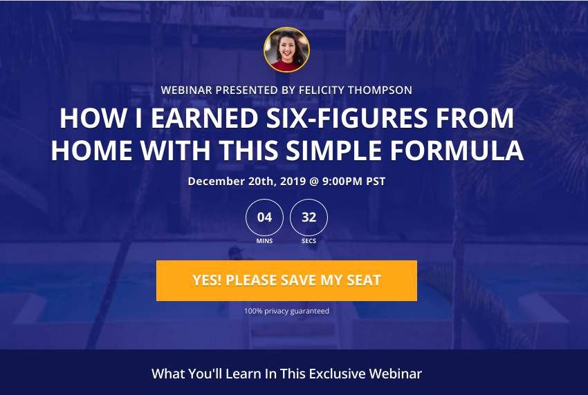
The image above (Fig. 1) is a screenshot of a common lander style. It’s actually a template that comes with Optimize Press, and marketers use this style a lot for webinar funnels. The deck is composed of a small image of the marketer, then there’s a short pre-headline, followed by the main headline. In this particular case, the designer chose to use a countdown timer in place of a subheadline. Finally, they have a big, prominent orange button.
Notice that there is no opt-in form visible on the page (Fig. 1). The button reads “Yes, Please Save My Seat,” but where do visitors actually type in their contact details? Well, this is a perfect example of a TWO STEP OPTIN. They click the button, and it triggers a pop-up box. The pop-up supplies a little more information and contains a form for them to submit their email address here.
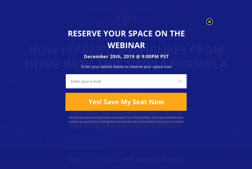
Keep in mind that the image above is NOT a new page but rather just a pop-up box that is “layered” over the original page. This is what the first button triggers. If you look closely at the image, you can even see the original page beneath the pop-up. This is because the opacity of the pop-up box was set to be a little translucent by design. You can also see that there is a little circle with an X in it at the upper right, this is meant to close the pop-up box.
The button in Fig. 1 is a two-step opt-in button that triggers the pop seen in Fig. 2. It’s impossible to tell if they are using a double opt-in process from just an image. If the creator does have a double opt-in process in place, we would only learn that by actually subscribing and seeing where it takes us. What we do know for a fact is that when visitors click the orange button in Fig. 1, a pop-up window appears with the opt-in form, and in this case, the only field the form contains is an email field (Fig. 2). This is a really effective technique. Take note of how simple and straightforward this design is.
Another thing worth mentioning here is that there is an image barely visible as the background of the page. It looks like there are palm trees and maybe a swimming pool in the image however, there is a blue layer of opacity over the whole thing to make it less distractive. The image simply adds some depth and texture to the page without becoming a focal point. This is important because it keeps the visitor focussed on the message and the button.
The color scheme is predominantly blue because blue has proven to convert more than any other color on web pages. Studies show that the shades of blue are often interpreted by the brain as a sign of stability and reliability. Businesses that want to project an image of security often utilize blue in their advertising and marketing efforts.
Yes, landing page anatomy is that easy. There aren’t many complex visuals here. There isn’t a need for much text on the page. A well-written headline and a prominent button are often all you need. Although this particular page design was intended for a webinar funnel, you should follow this formula if you want it to convert properly. This is the type of landing page that will convert extremely well.
Alternative Lander Style
Here’s another example of a lander design. This is the polar opposite of the previous example because instead of a two-step button, we now see the form right on the page.
This is another one from the OptimizePress template library, and it is a nice one to compare. Despite its complexity, it has a very clean design with one image and a significant amount of sales copy on it. Based on our experience, this would not convert as well as the one in the prior example.
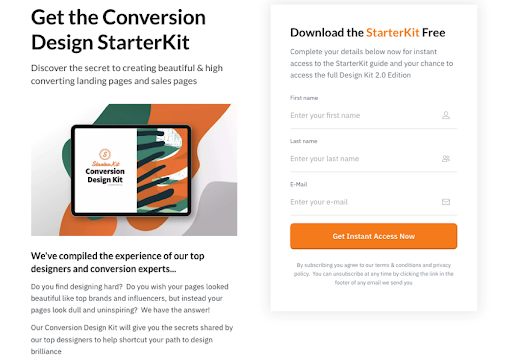
This lander (Fig. 3) is a little more complicated because it has a two-column deck. That means that the content is divided into a left/right format. The main headline and a sub-headline are at the top of the left column, and then there is an image of the product they are giving away right beneath them.
Including an image of the product is a great idea because it makes it more tangible for the visitor. Beneath the image, there is quite a bit of copy to read, and this is where you risk losing people.
When a visitor lands on your page, you’ve only got a few seconds to get their attention and keep it. At first glance, this page (Fig. 3) has a lot more material for people to read. There’s even some fine print on there.
We can’t just glance at this and figure out what’s going on right away. We actually have to read a few lines down the page. However, what we do realize almost instantly is that there is something to sign up for because that big optin form is readily visible on the right side. This type of page instantly triggers that spidey sense in people’s brains. “Uhh Ohh! They want my details!” This happens before the headline, and sales copy has had a chance to raise their curiosity and impulse. That’s why most people bounce.
The form on this page asks for First Name, Last Name, and Email address. That’s a lot of data in exchange for a freebie, it simply “feels” intrusive to most people. It also has some fine print below the submit button, and at first glance, that is also a deterrent. Even though the fine print may include text to make the visitor feel safe about spam, the fact that it is fine print raises a subconscious red flag. People tend to believe that fine print in contracts and agreements hide dangerous alerts and warnings.
In both of these examples (Fig. 1 & Fig, 3), we only examined the anatomy of the deck. The deck is simply the top portion of the page on your laptop that you can see without having to scroll. There may be even more stuff to consider beneath the deck. If so, that would just be even MORE stuff to distract the visitor and deter from the click.
There are a lot of different styles and designs to choose from when building your lander. The default template designs may all look beautiful but remember, these templates are typically created by graphic designers, not by marketers. The objective of a designer is to make a page pretty, the objective of a marketer is to make the page CONVERT. Your objective should consider BOTH.
Ensuring Your Lander CRUSHES It
Most marketers split test things like headlines, colors, and images… and yes, those things do affect conversion, BUT what matters most is your TRAFFIC source. More specifically, it’s the traffic temperature.
You can assemble the most amazing steak offer on the planet, but if you put it in front of a vegan audience, it won’t convert. Good marketing is not about getting a metric ton of clicks to your lander, it’s about getting TARGETTED CLICKS. Good marketing puts the right offers in front of the ideal audience. Doing it any other way is just a waste of time and money. Statistics tell us that you’ll probably have to learn that one the hard way.
All traffic demonstrates a “temperature,” which is our way of identifying an audience’s propensity to take action. Traffic temperature ranges from cold to warm and then HOT.
Cold traffic knows nothing about you or your product when they arrive on your lander. They are the least likely to convert into subscribers because they don’t know anything about you or what you can offer them. Your best chance at converting these sorts of visitors is by using a lot of impulse-raising tactics and creating curiosity on your lander.
Warm traffic has a vague idea of either who you are or what your offer is, or maybe even both. Generally, these types of visitors have been “pre-marketed” somehow. They received some sort of messaging about you or your offer before arriving on your page. Perhaps an ad captured their attention, or maybe they were referred by an affiliate that told them a little about you or your offer in an email.
Hot traffic arrives, ready to take action. These are people that already know, like, and trust you. They may have already purchased something from you in the past, or maybe they already follow you on social media. These visitors need little prompting and typically skip the sales copy and just click the buttons.
Landers should be tailored to the temperature of the traffic source. When you think this through in advance, you will have a very successful opt-in rate. Marketers that see traffic as an afterthought often struggle to build their lists and make any kind of sales. It is much easier to create an offer for the traffic than it is to create traffic for an offer.
The Power Of The Word FREE
Generally speaking, your audience enters their email address because they want to receive something for free. It doesn’t matter if it is a free webinar presentation, a free ebook, a free report, or any type of free resource. Basically, they’ll want to get their hands on it. For two reasons.
#1 They want it or need it. (because they are a targetted audience)
#2 It’s FREE.

After your visitors arrive at your landing page and decide to opt-in, you have the power to direct them anywhere you want. They enter their email address and click the button, which contains instructions. You can choose to send them immediately to the download page or to a page that asks them to go verify their email address. In essence, you decide where users are sent to when they click the form’s submit button.
The page you send them is essentially where they will be given access to whatever FREE thing you promised them on the lander. This puts YOU in a very powerful position because you can now control what you see next, and with great power comes ample possibilities! (Betcha thought I was gonna use a lame quote from Spiderman)
Bridging the Gap LIKE A BOSS
Now I’ll introduce you to a concept that has helped a lot of marketers become incredibly successful in list building and affiliate marketing AT RECORD SPEED. This is a concept that we pioneered many years ago called an Inviter Page.
The inviter page is a page you create to sit between your landing page and your download page. Think of it as a bridge page. The purpose of this page is to get each of your subscribers to invite more subscribers.
The concept is simple, and it has been proven to work over and over again. People who land on this page have demonstrated two things. They are interested in the subject, and they are willing to submit details in exchange for FREE STUFF. So your inviter page leverages this knowledge to make your list building go VIRAL.
This page offers them MORE free stuff in exchange for them to “invite” their friends to your lander. If they invite friends, you will reward them by sending them to a download page with BOTH items, the one you promised on the lander and the one you promised on the inviter page. BUT… at the bottom of the inviter page, you can place a little “no thanks” link that takes them to a download page with just the item they were promised on the lander.
Imagine after they optin, they are taken to a page that says something like:
"CONGRATS ON ORDERING
YOUR FREE EBOOK!"
Did you know that there's a video series that goes along with it?
I'd be happy to provide you with the videos for FREE as well, and all I ask in return is that you
spread the word about my website to your friends. Would you kindly click on this share button?

Viral list building is a tactic that has made a HUGE difference in our own business, and we urge you to look into it further. You can create a viral lead funnel using a variety of tools and plugins called share gates. If you’re using WordPress, you might consider checking out Buzzinar. The training inside the Buzzinar program explains the process in great detail, and the Buzzinar WordPress plugin will make it possible for you to do it on your website.
If the viral list-building process intrigues you even slightly, we highly recommend that you take a look at Viral Traffic Boost. VTB is also a WordPress plugin, but it simplifies the process and enables you to do even more advanced lead capture and redirecting with just one button.
There are a wide variety of clever tools like this on the market, and they can be very beneficial. The only thing we caution you on about share gates is that you do not FORCE your subscribers to share your page in order to claim their freebie. That would hurt your conversions as well as your reputation, and it’s just not cool.
The Step Box Phenomenon
We’ve already demonstrated that your success is not only predicated by how amazing your lander looks but also by its functionality. Subsequently, your continued success with the leads you capture will be determined by the way you handle what comes next on the download page.
“Step Box” is a term coined by us in January of 2014 while teaching our download page and welcome page strategies to MUA Students. After years of trials and split testing, we mastered a method for increasing the performance of our download pages and welcome pages.
We learned that the main thing our customers wanted the moment they get to our post subscription pages were INSTRUCTIONS. Your people crave simple instructions AFTER they have taken action. They want to be told EXACTLY what to do next. They often want instructions more than they want the product itself. If you haven’t been taking this into account you’re probably missing out on the huge opportunities for branding and monetization on your download pages.
After testing this tactic many ways, we learned that the most effective thing to do on a download page was to present the member with just THREE steps to follow. Over the years we tested various combinations of steps and we even tested the best order to put them in. Once we had the best combination of steps we put them in a bright box with a solid border and headline that reads “Do This First”. We displayed these step boxes on all our welcome pages and download pages. This was EXACTLY what we needed to take our viral lead funnels to the next level.
STEP ONE:
For our business, we learned that step one should be “Register For The Training”. A new member training webinar can be performed live after a product launch or it can be an automated webinar for your evergreen lead capture funnels. The key is to tailor this webinar to the NEW MEMBER, start by explaining to them more about what they have just gotten, and then transition into a congruent presentation that leads to a high-ticket sales pitch. If you do this tactfully your new members will love you for it and you will be very profitable. This is how the big money is made on the backend of high-converting funnels.
STEP TWO:
We learned that step two should be “Whitelist Our email” to ensure the deliverability of all our follow-up marketing messages. The best thing about having a targeted list of leads is that you can market products to them through email as an affiliate. Those emails are only as effective as their deliverability. You’ve got to get into the inbox if you want to be an effective email marketer. If you provide whitelisting instructions for your members it will dramatically increase the percentage of people you can reach through email even if only a small percentage of people actually whitelist you in their email client.
We recommend that you link to a thorough set of whitelisting instructions in your second step. Tell them what name and email address you’ll be communicating to them from. You can use this nifty little whitelist instructions generator to create your own whitelist page here.
STEP THREE:
Step three should be “Join The Community”. No one likes to be the first one on the dancefloor. We always create a community for our members to interact with our team and with other members and customers. The peer-to-peer help that will emerge in your group reduces support tickets and provides an additional venue where your members can get to know, like, and trust you. The most common way to do this is through social media with perhaps a Facebook group or even a YouTube channel. This also gives rise to yet another platform where you can advertise or market to your members as an affiliate.
The Benefits of Adding a Step Box
Whenever any prospect performs an action online, the next thing they immediately seek is instruction. Even if you gave them exactly what you promised on the lander or the sales page if you don’t immediately provide them the steps of instruction they need you are just leaving your people hanging.
Step Boxes simply work. We’ve proven that by inserting a small box with steps one, two, and three, we make our customers happier and we make more money. A Step Box will add a spike of income to your bottom line from webinar sales. A Step Box will also make you more profitable (long term) by increasing email deliverability. Finally, your Step Boxes will reduce support headaches while building your brand in your own online community.
Critical Post Subscription Process
Don’t get tunnel vision, be mindful of the process you are putting your people through AFTER they subscribe or buy from you. After all, what good is it to have a killer lander that pulls in loads of subscribers only to piss them off (or lose them all together) on the pages that follow? You’ve got to look at the whole picture and consider the whole FUNNEL, not just the lander.
There are varying schools of thought on this. Some marketers find that sending prospects directly to a sales page after they opt-in to the lander is an effective strategy. Their lander may say, “I’ll send you a free report on how to start a garden if you click this button and input your name and email address.”
Then after they click that button, they’re taken to a page with the download button right at the top as promised. However, the download page itself is actually a sales page for their full gardening course Right beneath the download button there may be a small video that says, “Wouldn’t you be interested in learning how we did this before you download this?”
There are many ways that you can utilize a lander. The lander serves as the gateway to your funnel. You might utilize it to direct them to an inviter page, which will help you increase your list by attracting more traffic and leads. You may send them to a step box that will allow you to monetize the leads by registering them for a webinar, adding them to a group, or sending them to another website. You may even send them directly to a sales page after they opt-in. Or as some marketers do, you may test a combination of these strategies on your particular type of audience.
It’s your funnel, it’s your business. You can do whatever you want with those three stages. Just keep in mind that once they’ve given you their information, they carve instructions. We focus on longevity over quick cash because in the long term it is way more profitable. We teach our students how to leverage every inch of their digital real estate to make as much money as possible, consistently and reliably. That’s why we recommend…
An attractive minimalist lander design with a two-step opt-in process that leads to an inviter page and ultimately a Step Box on the download page.
You Are Now Ready To Set Up Your Killer Landing Page!
Keep in mind that your landing page should be concise. Get to the point quickly. Do not SELL on landers, that’s what sales pages are for. Sales pages should focus on features and benefits, be thorough, include a lot of sales content, and tell a story. A landing page, on the other hand, must be brief.
Landers must be concise and get right to the point. “Enter your name and email address to receive this freebie.” Boom! Something along those lines would be far more effective than a detailed explanation of how and why they should submit their name and email address. Building curiosity works well here as opposed to making a list of all the reasons why your free report is so amazing. Don’t overcomplicate the copy or make it too busy with visuals. Remember that keeping it basic and attractive is crucial because you never have another chance to make a first impression.
Happy lead hunting!
By the way, do you have a lander that utilizes the strategies we discussed here? If so, we’d love to see it! Tell us how you did it and drop a link in the comments. Heck, it may even get you some free traffic.
8 replies to "KILLER LANDING PAGES: HOW TO CREATE LANDERS THAT CRUSH IT LIKE A PRO"
Great post. I never thought of adding a step box to my thankyou page. I don’t have a download page, I send the link to download in an email. I do have an affiliate link on the thank you page.
Continue sending the link via email but consider adding a download page as well. You can do alot more with a download page than you can with an email, like add an inviter and/or a step box!
Great article, I do struggle over the word free as I am told it is a spam trigger…. I tend to use the word “Complimentary”… as in my landing page here
https://firststeps.kartra.com/page/HowToMakeMoneyOnline
what do you think about that
Your page is simple and straightforward. It should convert well. Have you sent traffic to it?
Regarding the word “FREE”… That word commands more attention than almost any other word in the English language other than your name. Whether people are looking for “the catch” or they are looking for the freebie, the point is that FREE makes them look.
As for triggering email spam filters, my only response is “meh” – is that possible? Maybe. There are lots of words that could throw a red flag on any of your emails at any given moment by any of your subscriber’s email clients. Generally, I don’t splatter the word free across all my email messages, but I also don’t avoid using the most powerful word in marketing because of a spam filter.
When it comes to email, my advice is that you use “Free” tactfully and tastefully. Don’t overdo it and don’t ever disguise it with spaces and asterisks like F*R*E*E. that kind of stuff makes marketers look like scammers. When it comes to avoiding spam filters and marketing folders the best thing you can do is urge every subscriber to whitelist your sending email address. As part of our step box process, we send all our new subscribers to this page https://higherlevelstrategies.com/whitelist/
Surely, using the word free in your ads and on your pages will not affect your email spam scores. If you are really concerned about how your email copy is ranking on the spam assassin meter there are lots of free tools out there to scrub your emails before you send them. For example… mailmeteor has one https://mailmeteor.com/spam-checker but if you go by that your email copy will have to consist of just “hi” and “bye”.
Thanks so much for the response…… and for stating the obvious fact that I had overlooked!…… Of course, the use of the word FREE before they have signed up for email will not trigger email spam filters… I will now change my page copy to use the word Free. Thanks so much for freely sharing your insights.
Hi Omar, a very in-depth and valuable post, thank you.
I am a fan of the step box process as many people can struggle to access or download your offer. In particular for my main business as we have many free educational teaching resources for teachers and students (maths, English, health and safety etc…)
Here are 2 landing pages we have one for my main business and one for my blog, I would like to hear your thoughts and recommendations on these 🙂
https://www.smartt.me.uk/first-aid-ebook/
https://barryjoyce.com/free-unlimited-images-videos/
Just a thought – honestly, nobody like subscription forms and that following later (weekly offers, daily notifications and simmilar annoyancies).
Isn’t it better to use a content locker for a free one time PDF download and put the subscription there so if the reader likes it then willingly go and subscribe? This way will get a lot less leads for the mailing list but those who subscribe will be a super targeted audience.
Absolutely not. You lost me at “get a lot less leads for the mailing list”. The audience comes before the list, its where you build the list from. Give them 100% free content to get into the audience. Facebook group, Youtube channel, Instagram page… whatever… THATS the digital stadium where you give them the 100% free stuff for them to “try out”. Give them all the free PDFs you want in there and load those PDFs up with tripwire links to your landing page. On the lander use. 2 step optin form, works like a charm.